The Problem & Opportunity
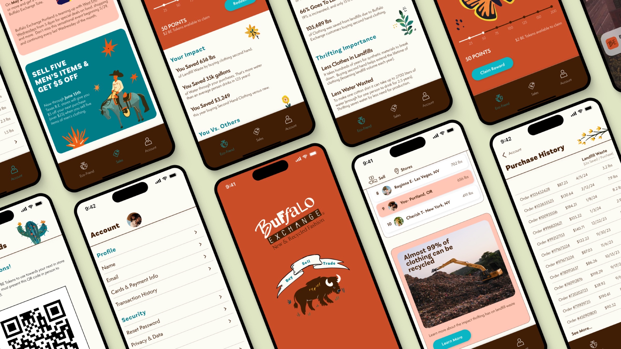
Fast fashion overwhelms landfills by the second. Secondhand purchases reduce this by cutting demand for new production. Buffalo Exchange shoppers had nothing to show for the good they were doing with their purchases. Building on the chain's existing branding, I designed a companion app that tracks each trip's landfill waste diverted and money saved, so it becomes a sustainable habit worth reposting.
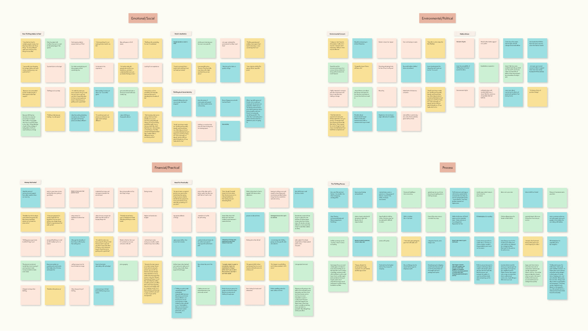
Affinity Map
User Personas
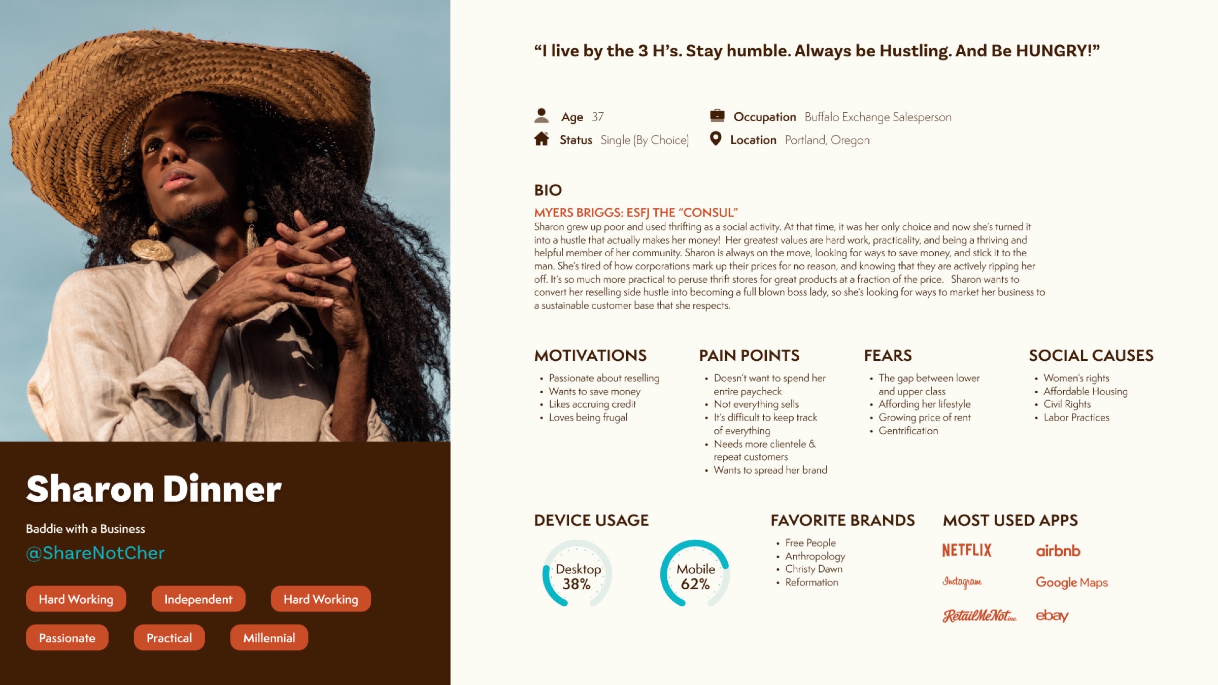
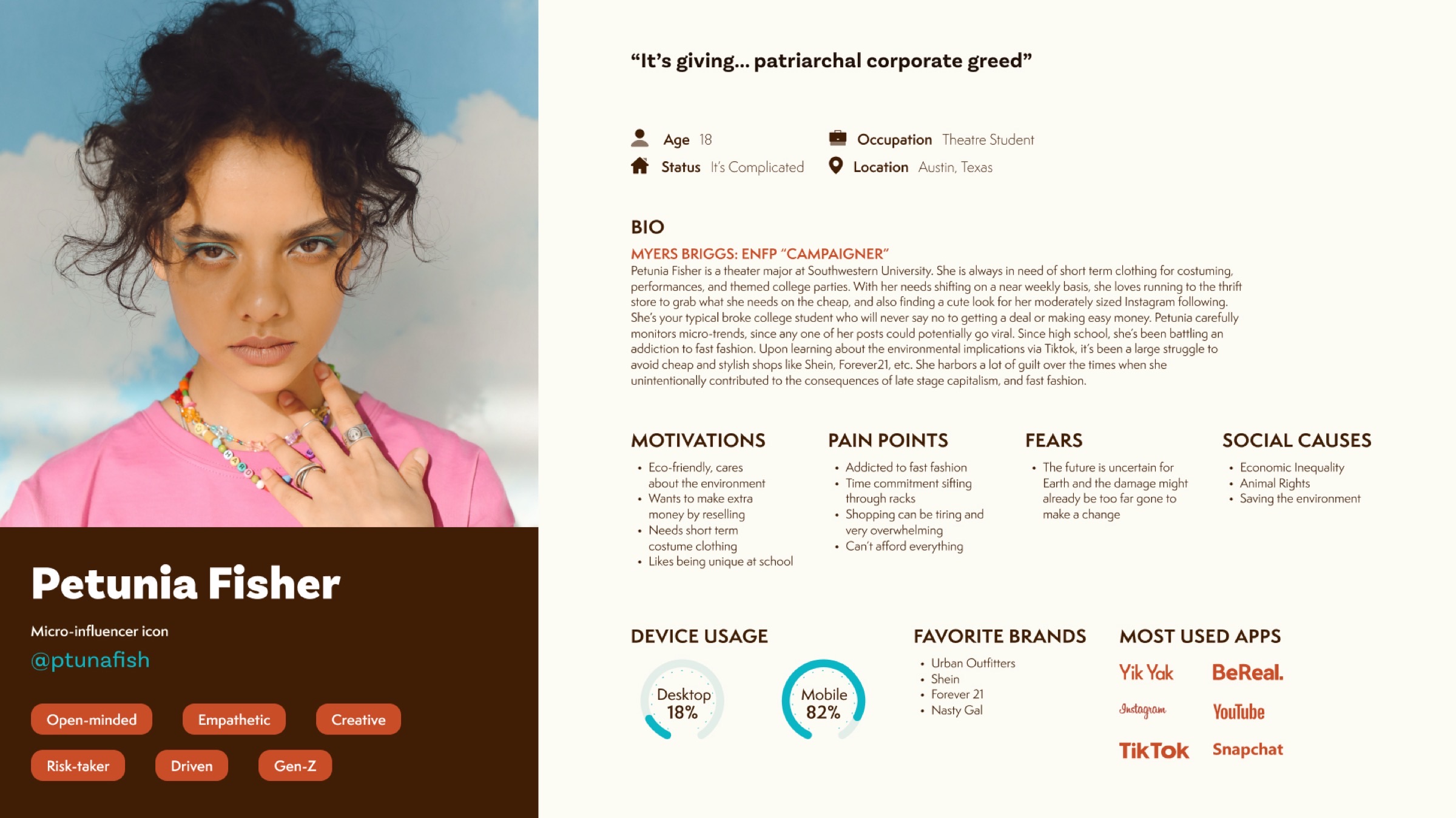
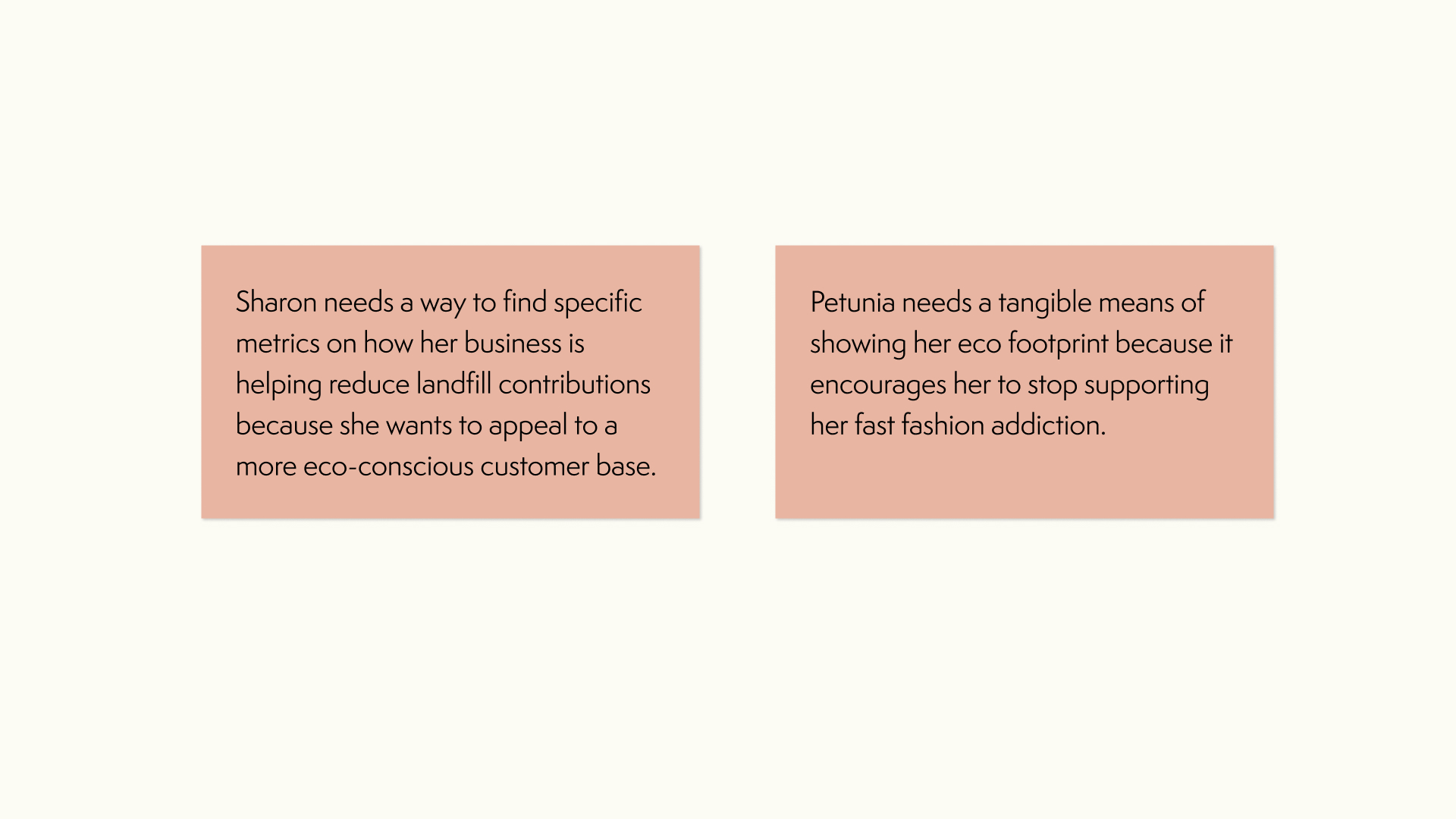
Point-of-View Statements
Branding System
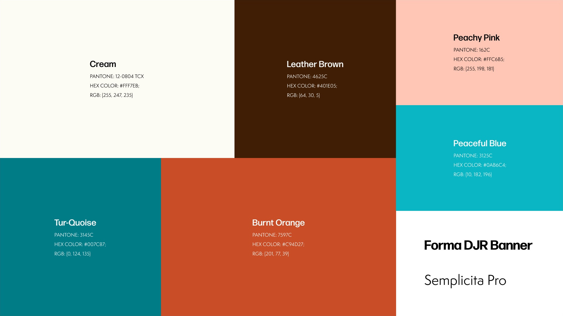
Buffalo Exchange has strong branding its shoppers recognize, but the system had drifted into inconsistent variations across its in-store collateral, website, and merchandise. This app's palette and typography unified the existing web presence and extended the identity.
Color Palette & Typography
Information Architecture
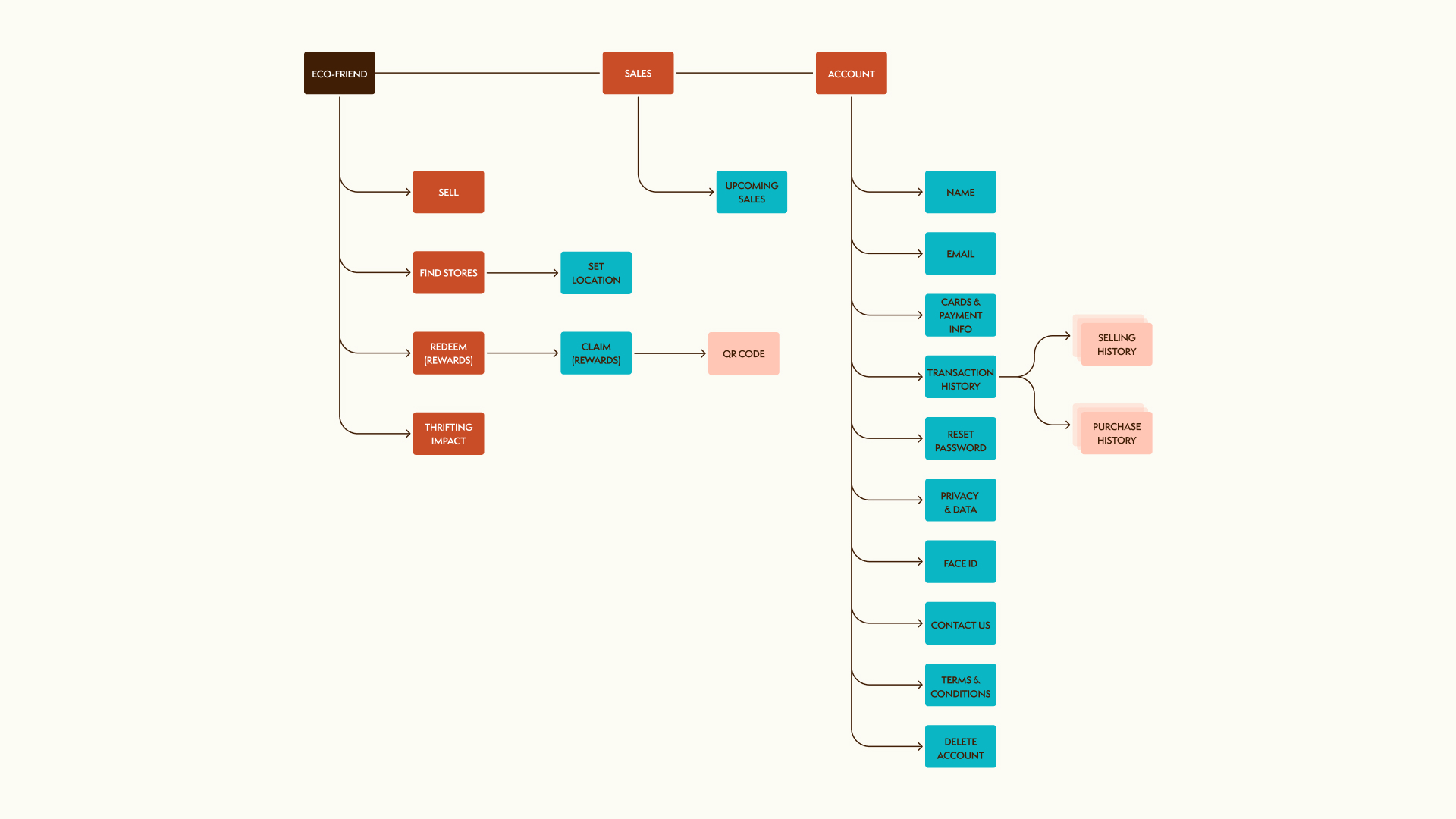
The point-of-view statements set the priority: shoppers should see their impact immediately, not have to dig for it. The sitemap and user flow were structured around that, putting shoppers' impact and rewards on the shortest possible paths from launch to redemption.
Sitemap
User Flow
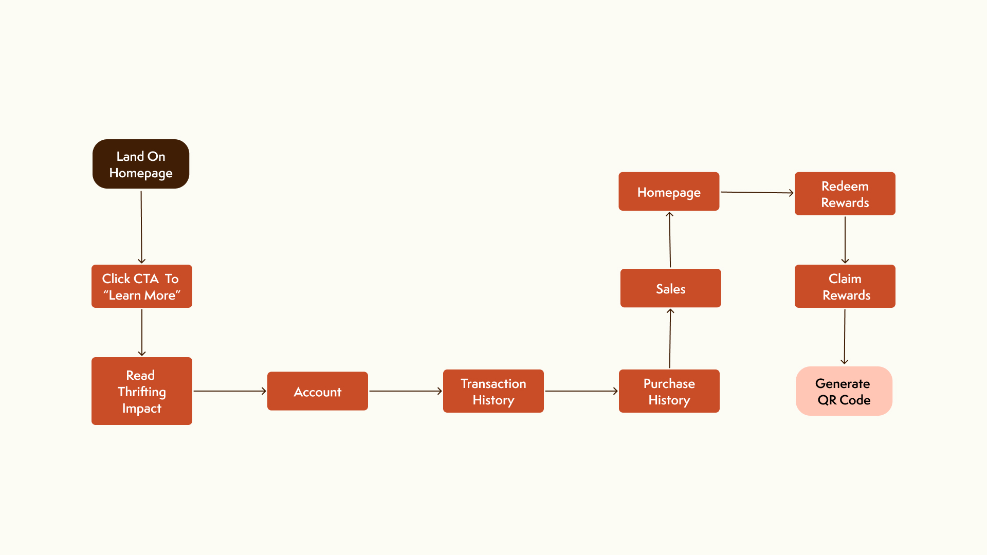
Application
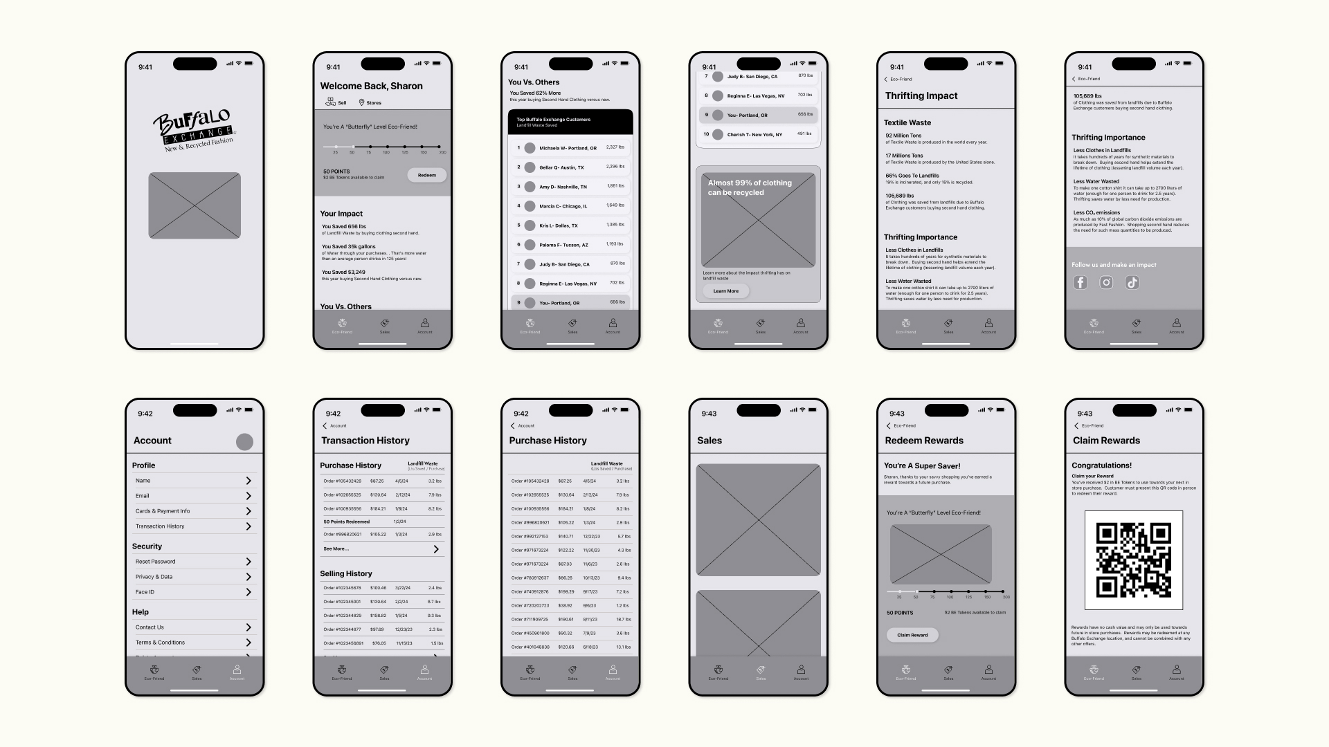
The wireframes put that architecture to the test in low fidelity, proving each journey worked before any visual identity was layered on. The three flows showcase how users meet their needs in the app: getting specific metrics on their impact, tracking their sales, and redeeming rewards toward their next purchase.
Wireframes
Mobile UI: Lock Screen to Thrifting Impact
Mobile UI: Account to Sales
Mobile UI: Rewards Redemption