The Problem & Opportunity
DistroKid is the distribution backbone for millions of independent musicians, but its brand felt provisional, its UI generic, and its positioning against CD Baby, TuneCore, and Ditto rested entirely on price. The opportunity was to build a brand that earns artist loyalty by reflecting their seriousness, not undercutting it.
Site Audit
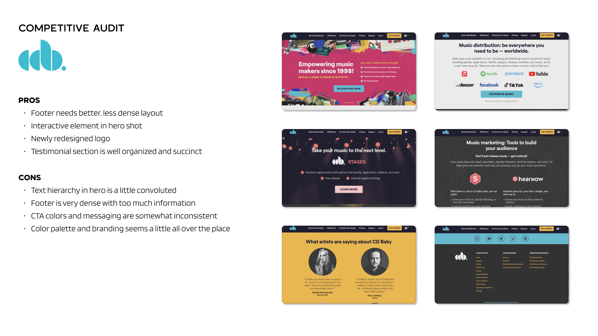
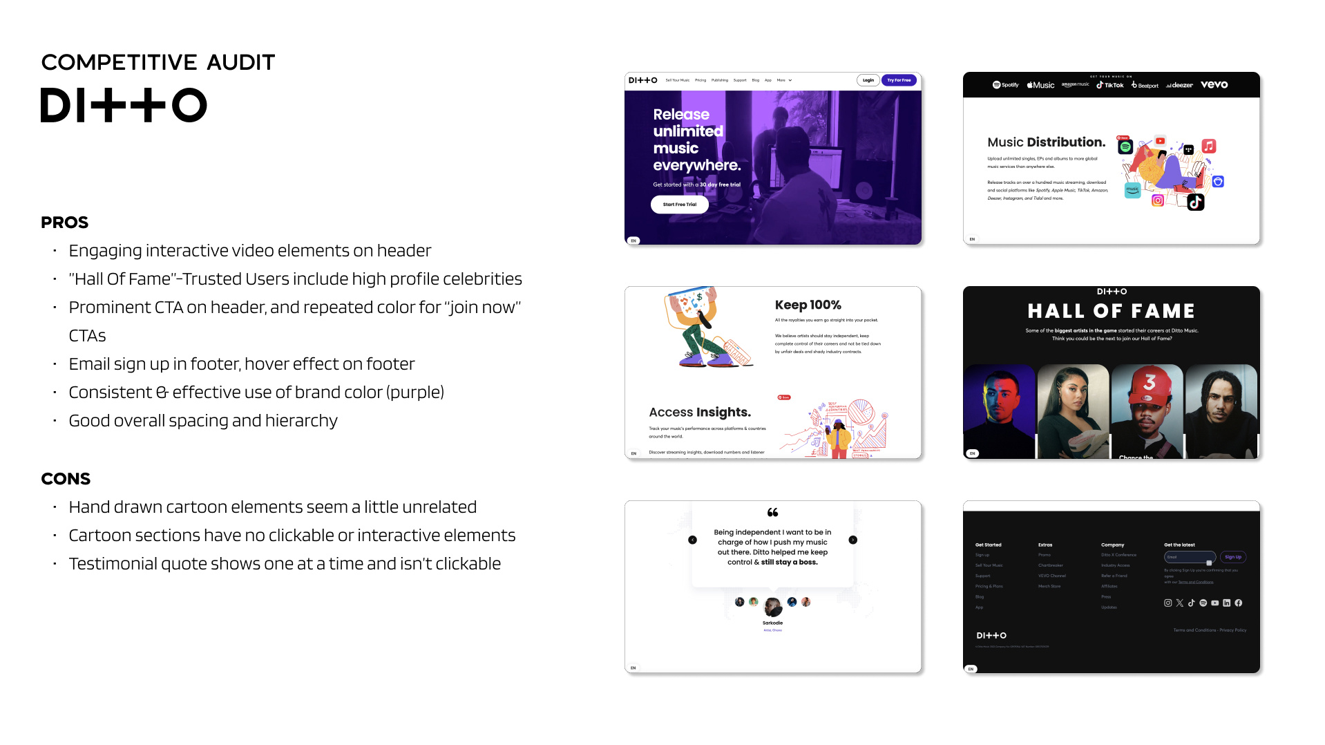
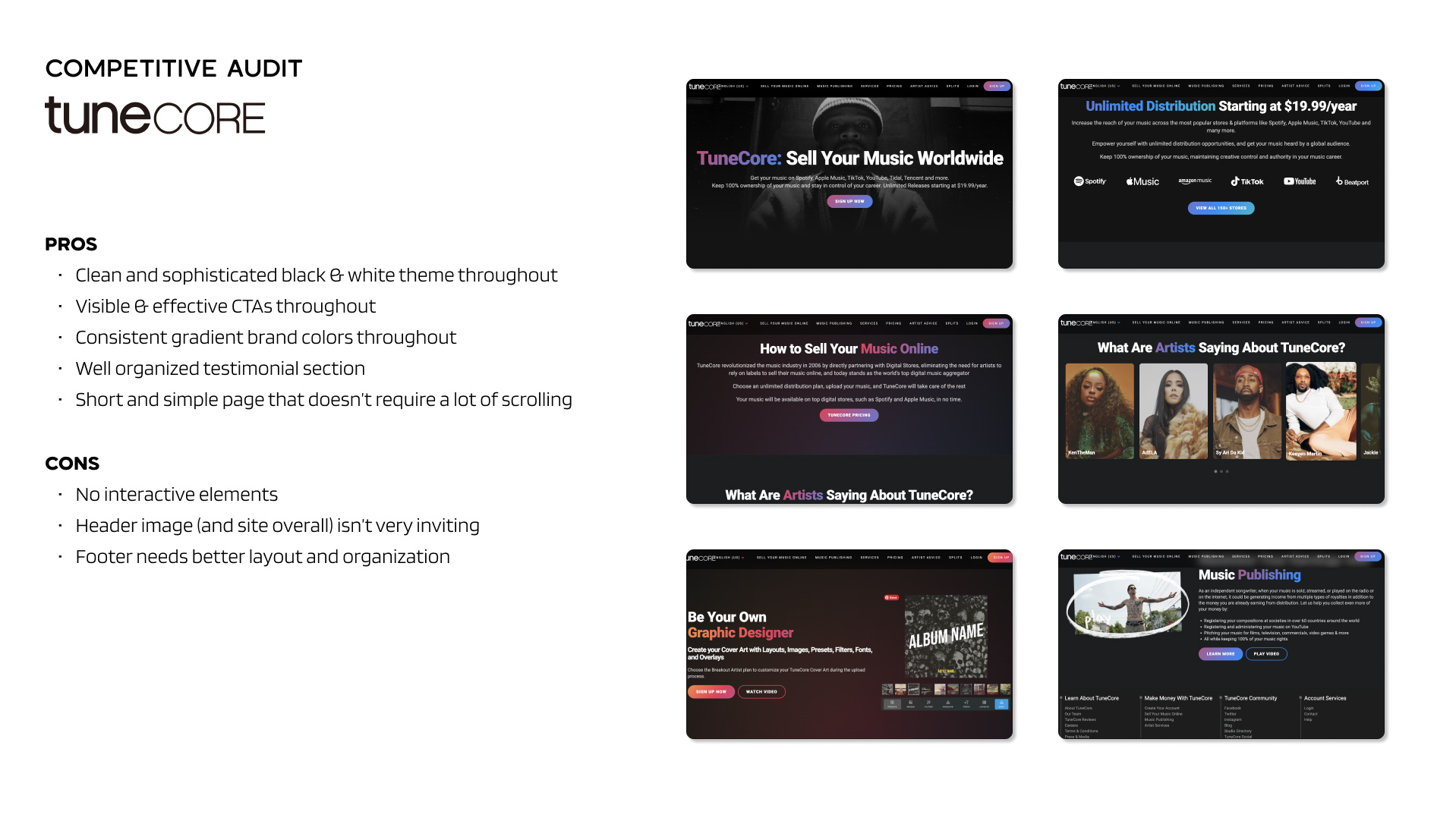
Competitive Audit
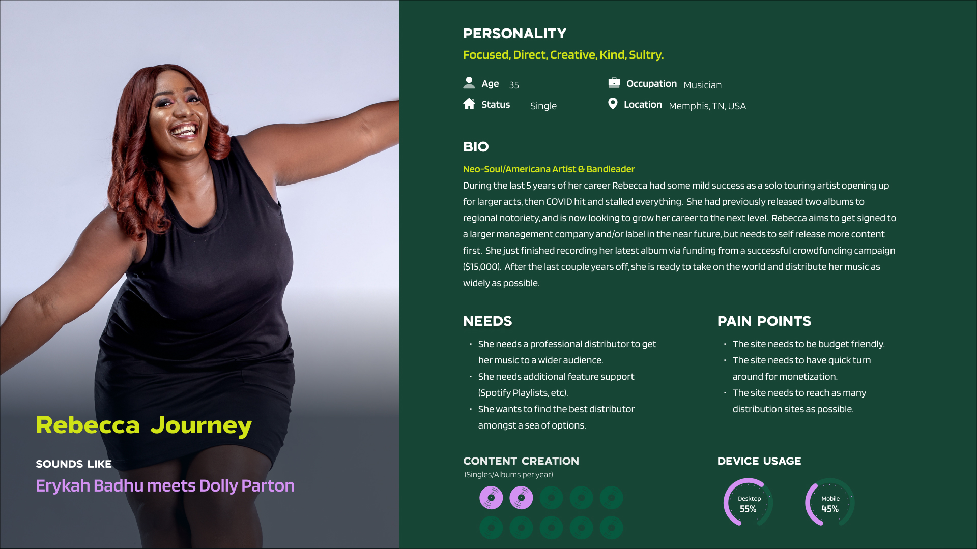
User Personas
Branding System
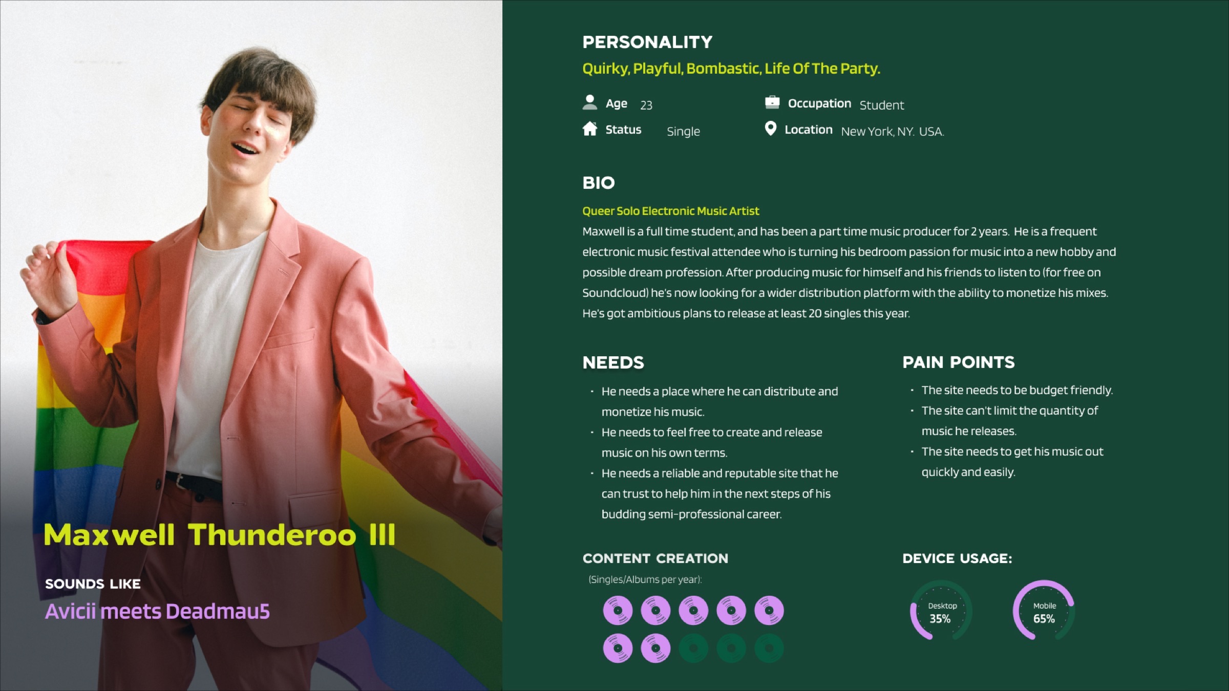
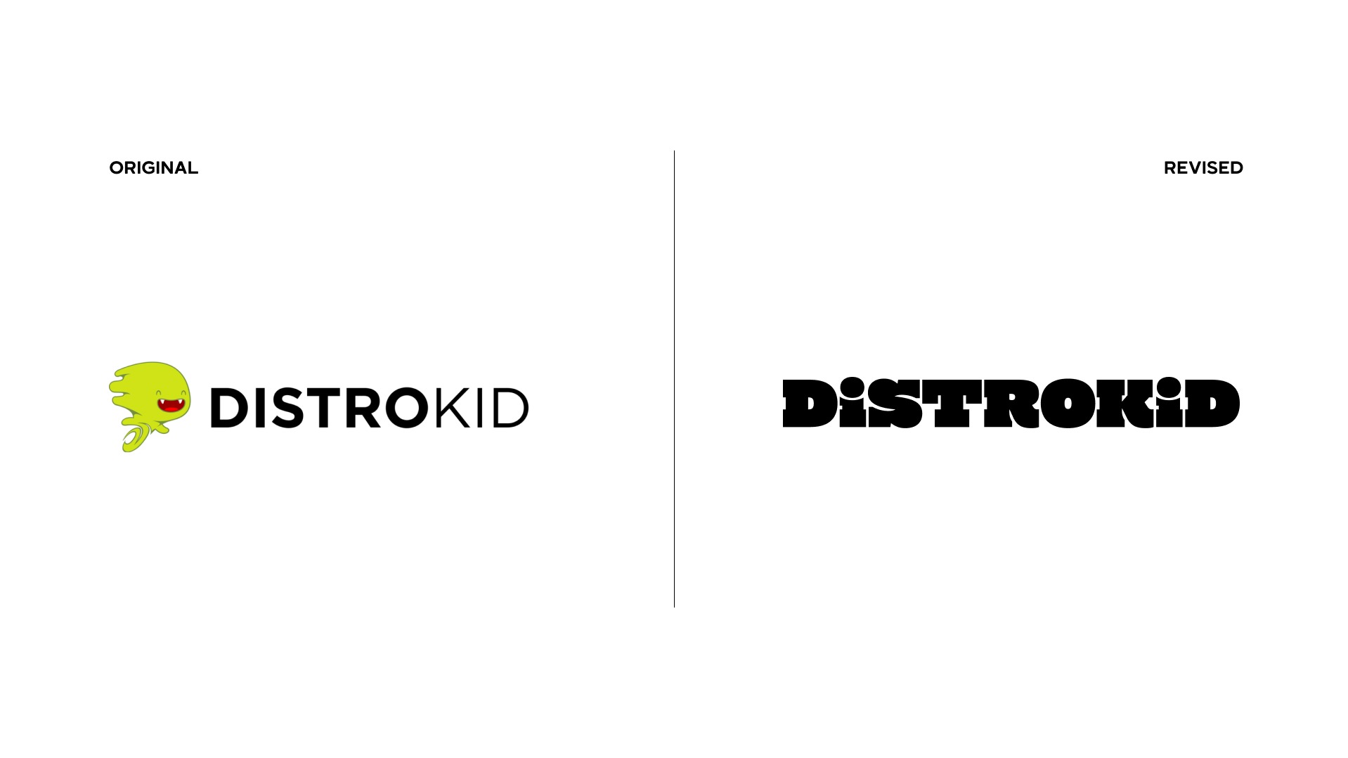
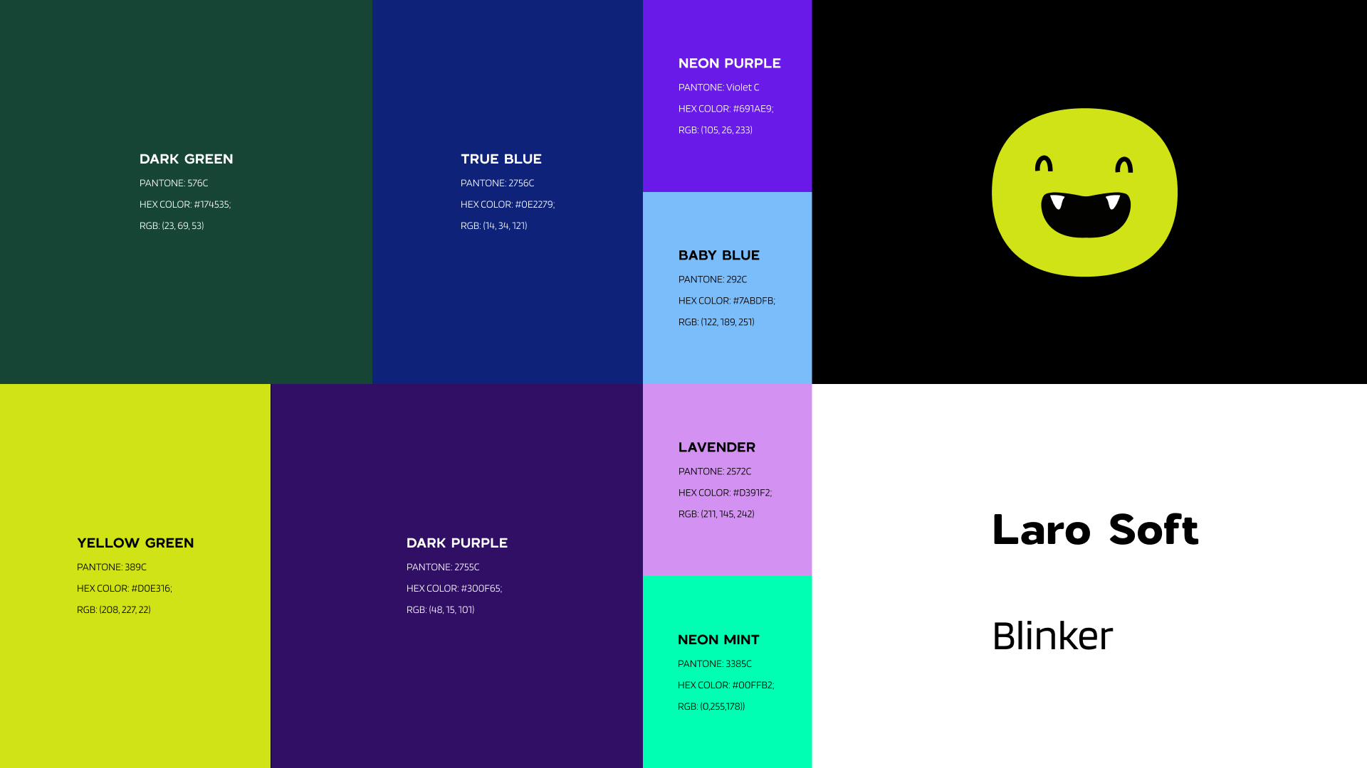
Both personas described the same tension: these artists run their music like a business but were being marketed to like hobbyists. The new logo mark, color palette, and type system are built to read as a professional yet innovative tool, so the brand signals credibility before a visitor reads a single feature.
Logo Design
Color Palette & Typography
Application
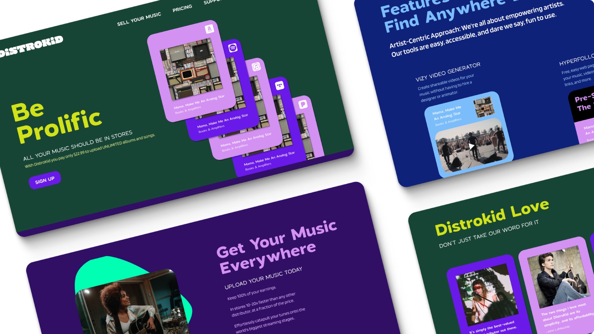
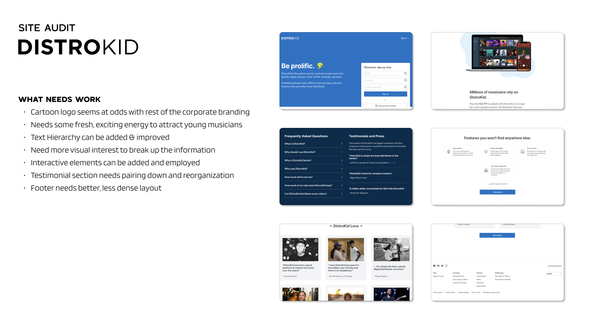
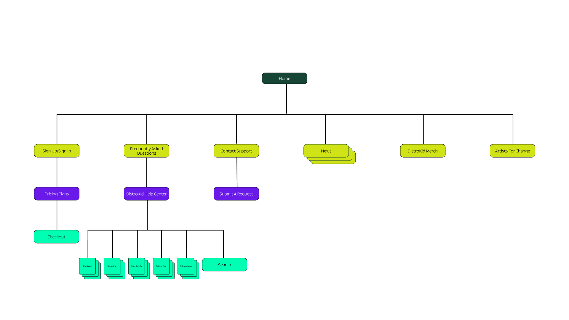
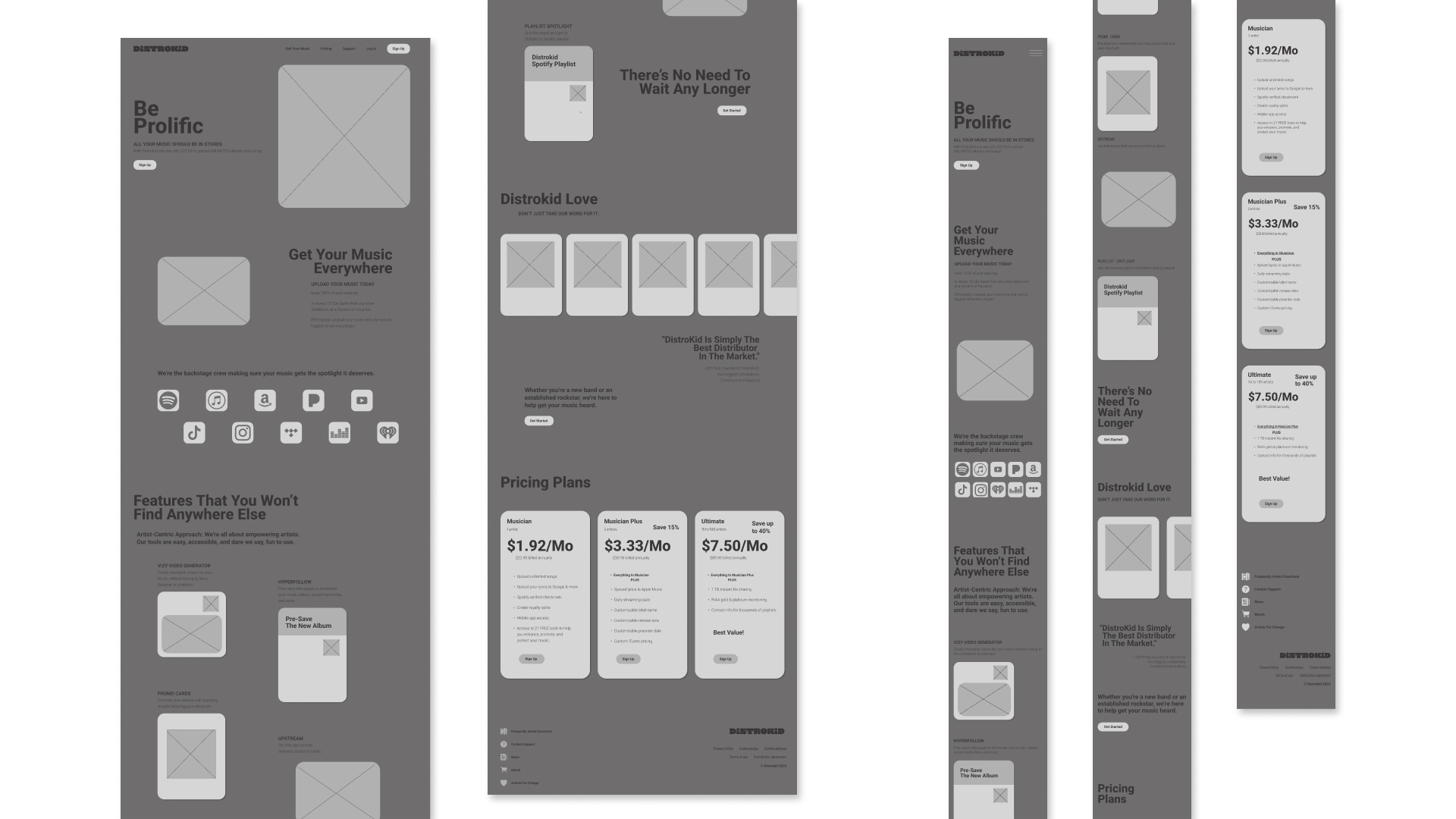
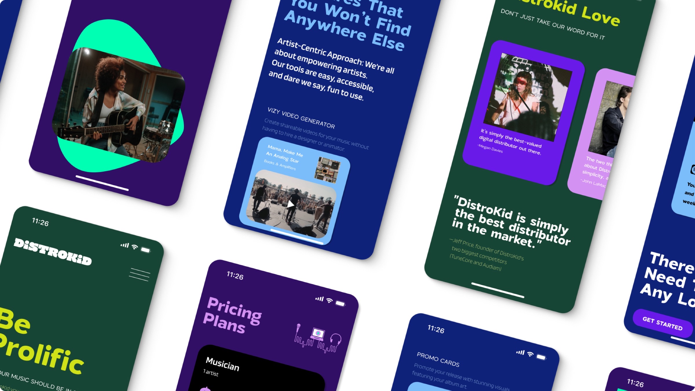
The site audit surfaced structural problems, not just stylistic ones. Text hierarchy was weak, information sat dense with little visual interest, and sections like the testimonials and footer needed reorganizing more than just re-skinning. A new sitemap and wireframes came first, then the visual system applied across mobile screens and the full desktop site.
Sitemap
Wireframes
Mobile UI
Website Redesign