The Problem & Opportunity
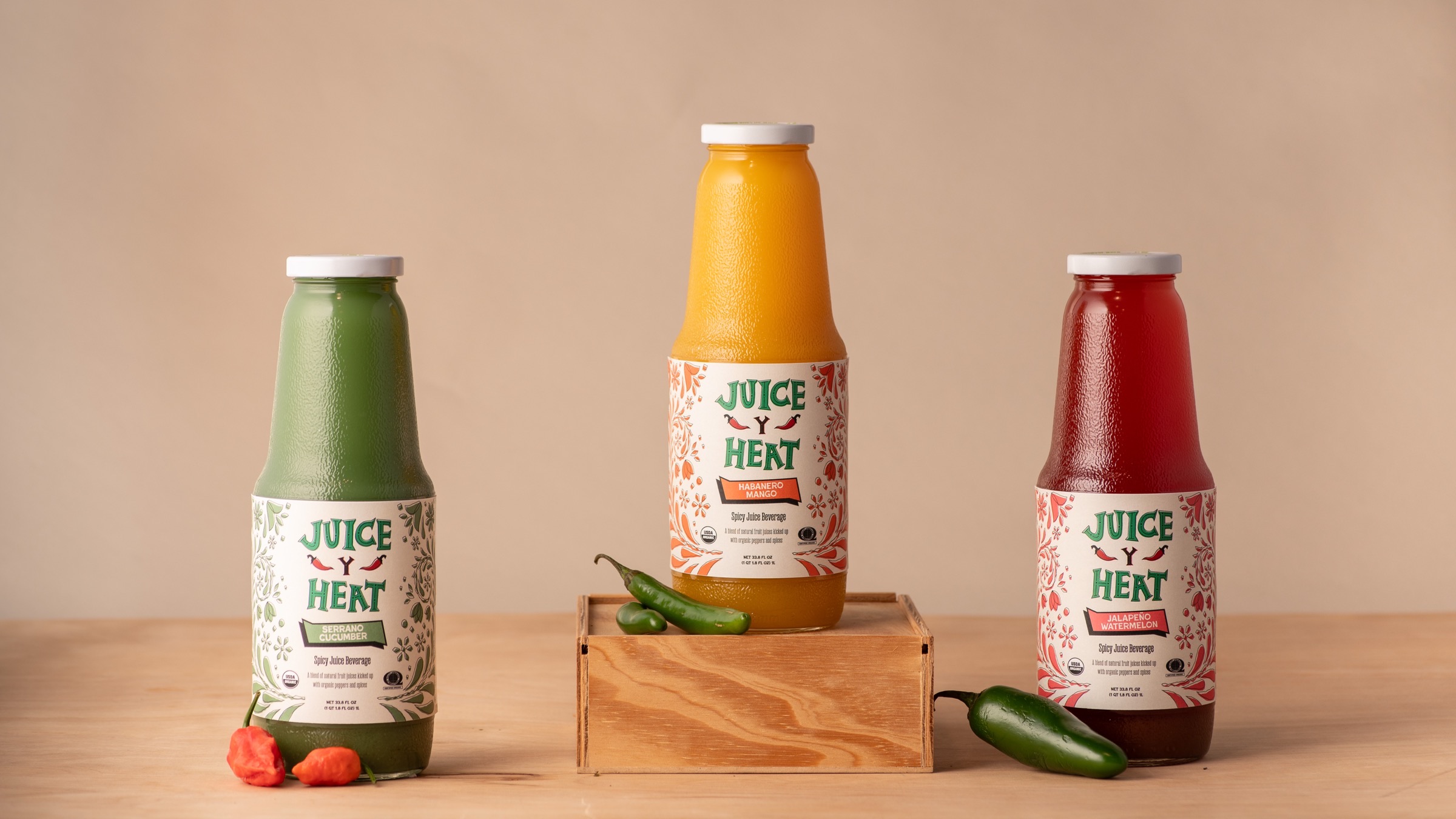
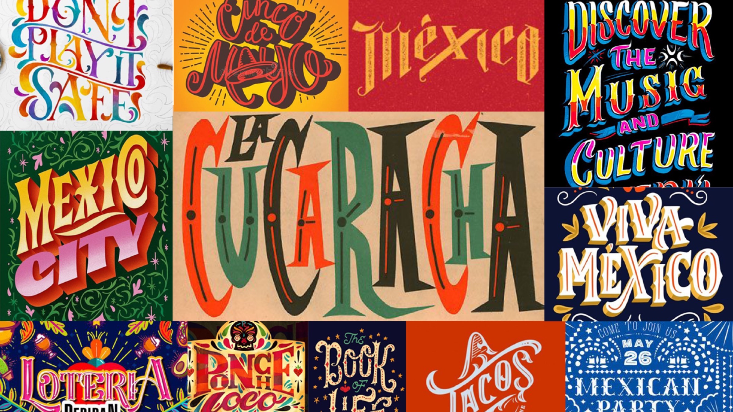
The non-alcoholic category has exploded, and most brands answered with minimalism and muted palettes. Juice Y Heat approached it from another angle: a Mexican-inspired concept built around spice, vibrancy, and craftsmanship, with a hand-lettered logo and packaging designed to make the bottle impossible to ignore.
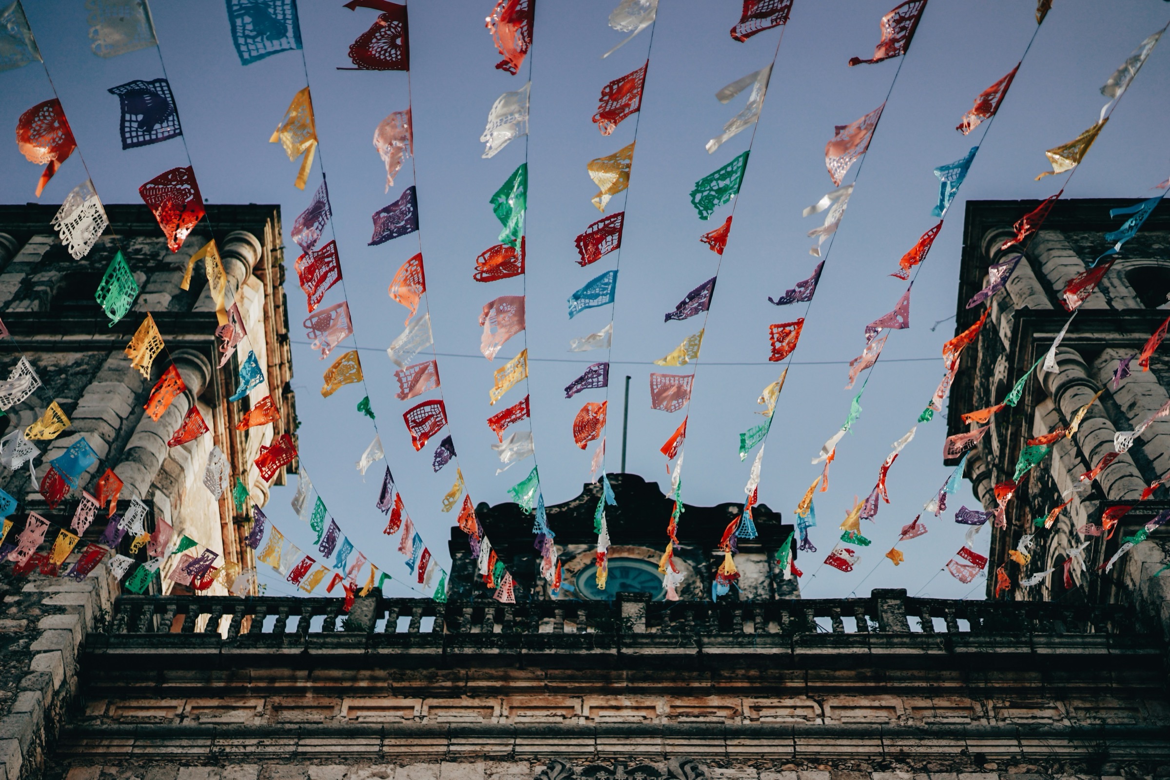
Moodboard
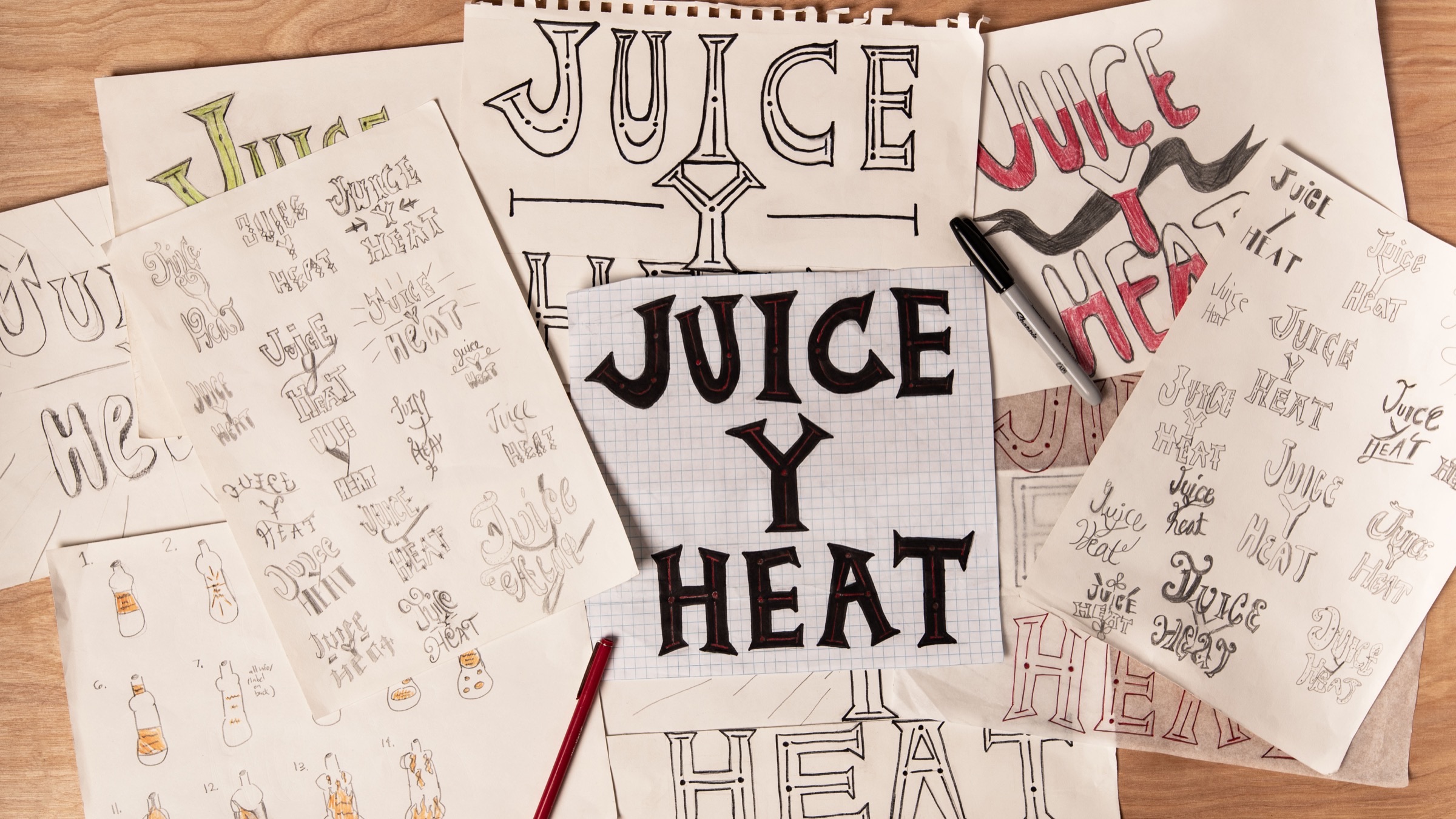
Hand Lettering Process Work
Brand Identity
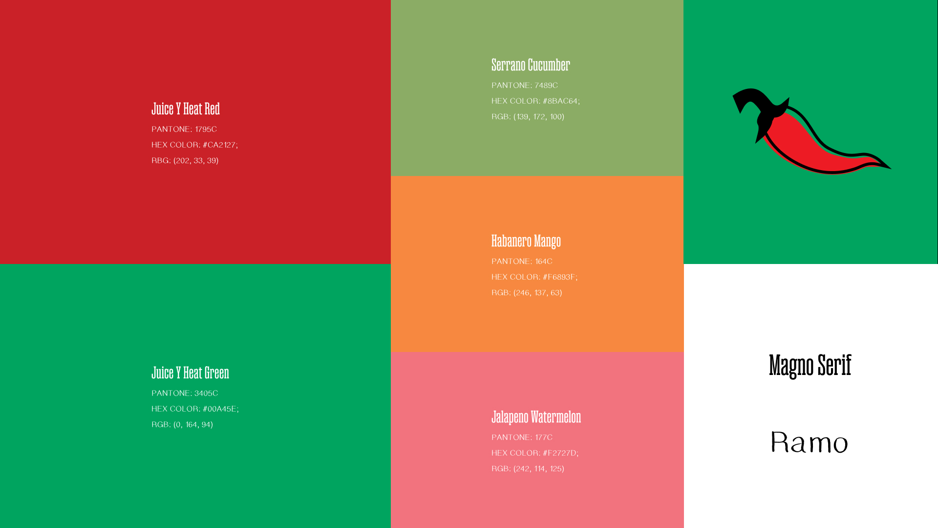
Every element had to convey the vivid concept on its own. The saturated palette matches the bold type choices, and the hand-lettered mark creates a long-lasting impression like Juice Y Heat's flavor.
Color Palette & Typography
Logo Design
Application
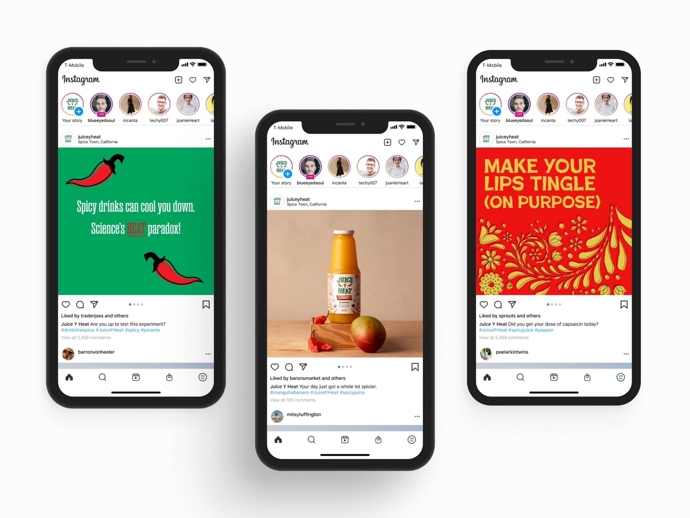
The social campaign showcases a brand that is unmistakably itself, inside a feed built to scroll past.
Social Media Posts